Category:
Web Design


Role: UX Designer
Duration: July 2023 - January 2024
Team: Kalyn (Design Team Lead), Keri (Marketing Manager)
Tools: Adobe XD, Wordpress, Balsamiq
Project Overview
KDG is a tech consulting firm out of Allentown, PA that’s been around for nearly 20 years, offering everything from custom development to accounting. As the business evolved, the team saw an opportunity to improve their online presence and tackle common user pain points with a full website refresh.
I was the main designer on this project, working closely with both the marketing and design managers to bring the new site to life—one that better reflects KDG’s goals and connects with their audience.
Brand Guide
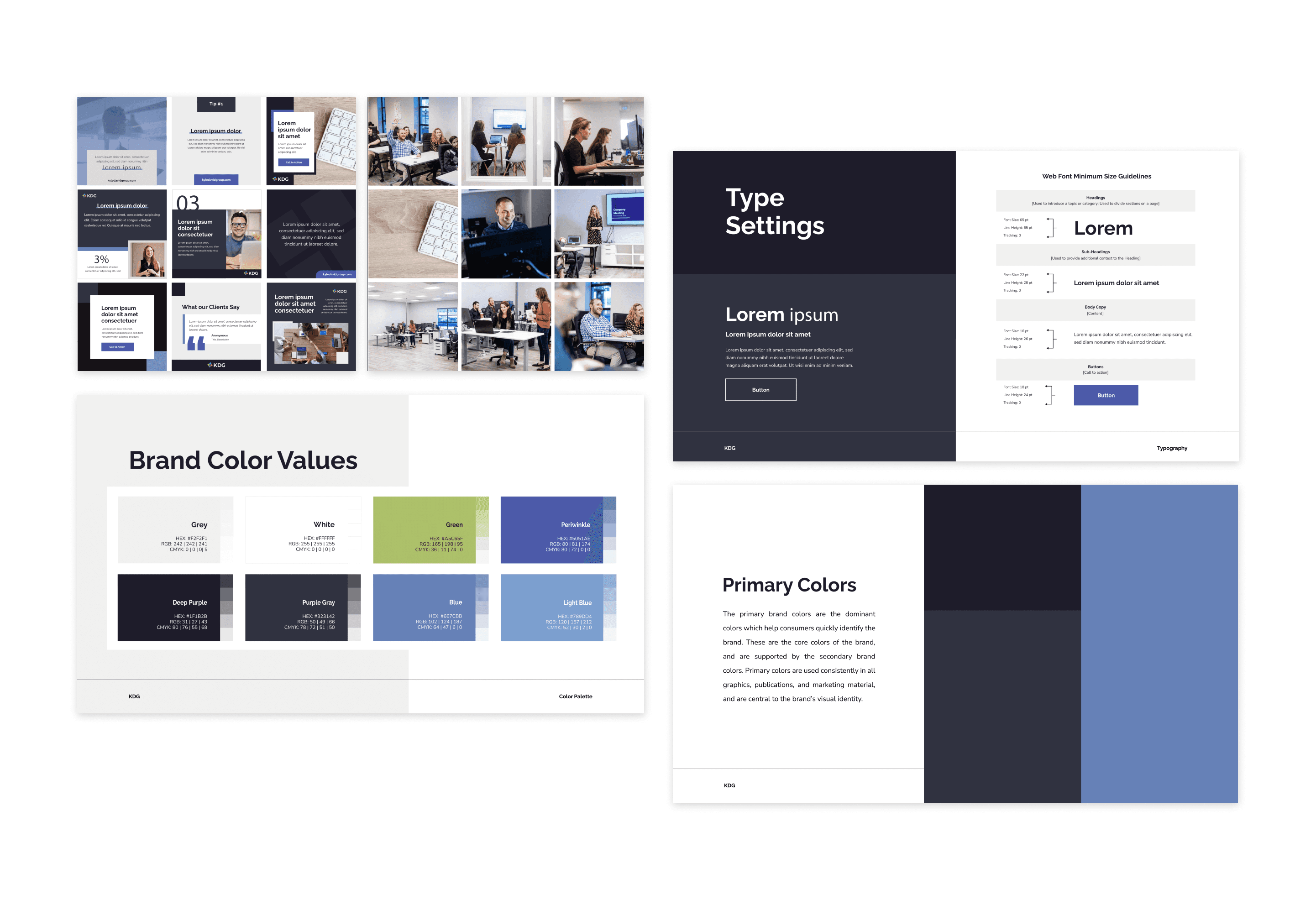
The company was in the middle of a brand refresh, so I made it a priority to get familiar with the new brand early on. Since visuals were a key focus, we started by locking in the overall look. From there, designing the rest of the site was much more efficient—we skipped heavy wireframing and used the homepage mockup as a reference point.
Empathize
To kick things off, we needed a better picture of who we were designing for. I gathered insights in two main ways: by chatting with the sales and marketing teams, and by reviewing behavior data through PageSense.
The sales team’s firsthand conversations with clients gave us a clearer idea of what our audience is looking for—and where things might be falling short. Two major pain points stood out:
Misaligned Expectations
A lot of leads didn’t fully understand our value upfront, which led to misaligned expectations and made pricing feel like a blocker.
Unclear Mission
KDG’s core consulting capabilities weren’t coming through clearly. The site didn’t do a great job of communicating that we’re here to support and elevate our clients’ missions—not just provide services.
Web Analytics Review

Next, I jumped into Zoho PageSense, a web analytics tool, to see how users were actually interacting with the current site. Heatmaps and session recordings gave us some clear indicators of where users were dropping off or getting lost:
Low Engagement with Key Content
Users were skipping over sections that we considered really important.Early Drop-offs
About half of visitors left after the hero section—especially those who clicked into blogs.High Bounce Rate
The homepage had a bounce rate of around 60%, which was a red flag.
User Personas
With these insights in hand, I built out three user personas to guide design decisions going forward:
👨🏻💼 Small Business Owner
Focused on simplifying processes and making data-driven decisions. Needs to see clear proof before committing.
👩🏻💼 Job-Seeker
Looking for a collaborative, stable workplace—especially in the wake of recent layoffs.
💁🏻 Marketing Professional
Wants to grow their company’s audience and choose service providers they can confidently recommend to leadership.
Competitor Analysis
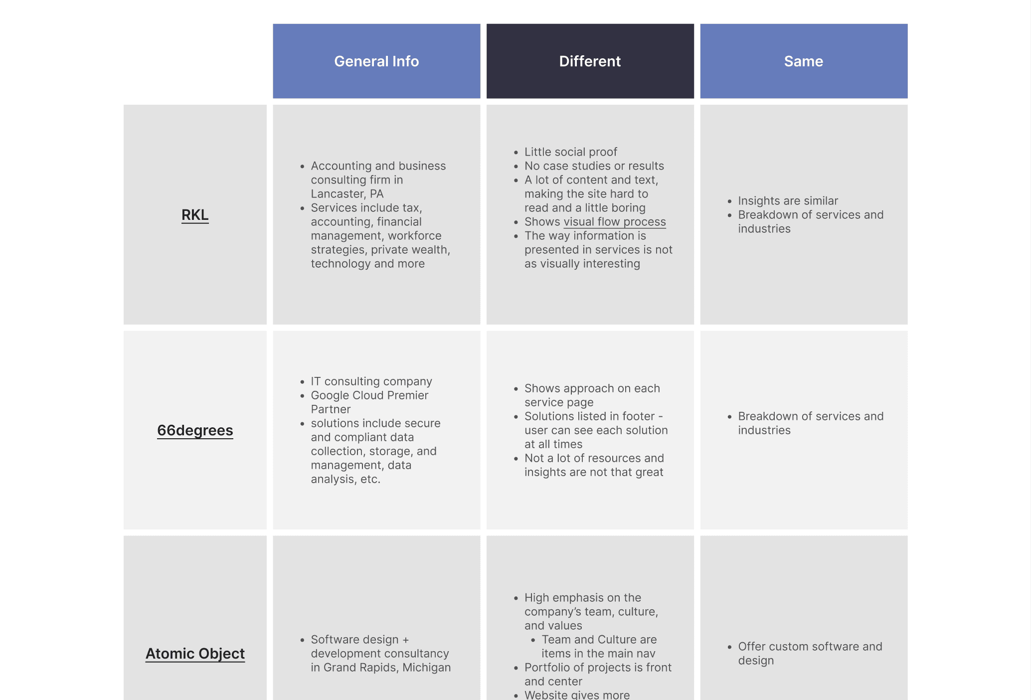
To round out our research, my marketing manager and I did a deep dive into competitor websites—both local and national. We picked up on a few good ideas and spotted a bunch of things we didn’t want to do. It gave us a clearer view of where we could stand out and how to better serve our users.
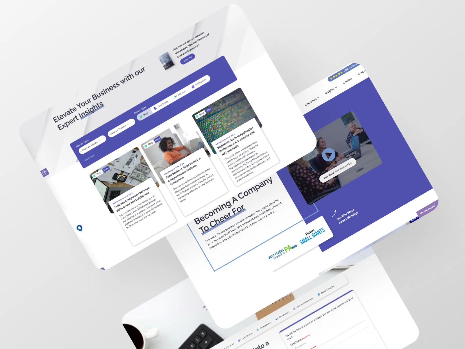
Mockups
Once we understood who we were designing for, I moved into mockups. Every design choice was backed by what we learned in the research phase, and I worked closely with our design lead to make sure everything aligned.
Each page went through multiple rounds of feedback and iteration, getting final sign-off from leadership before we moved forward.
Key Additions:
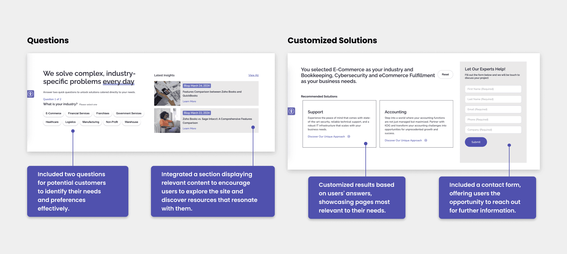
Homepage Form
This new form helps first-time visitors find relevant content by asking about their industry and needs, then directing them to the right pages.
Service Process Visuals
Every service page now features a visual of our engagement process, giving users a better sense of what to expect.

Transparent Pricing
We broke down pricing based on engagement type and included real examples, making it easier for users to understand what they might invest.

Building with WordPress

Once designs were approved, I built out the site using WordPress and Avada Builder. I made heavy use of global elements and reusable components to speed up the build and make future updates easier.
With over 50 pages to launch, I kept a close eye on the timeline and coordinated with our in-house dev team for any custom features (like filtering). For custom CSS, I worked with my design manager to get things just right.
Launch and Promotion
🚀 The new site launched in late January 2024!
We sent out an email blast and shared the news on social media to let our audience know what was new and improved.
Post-Launch Monitoring
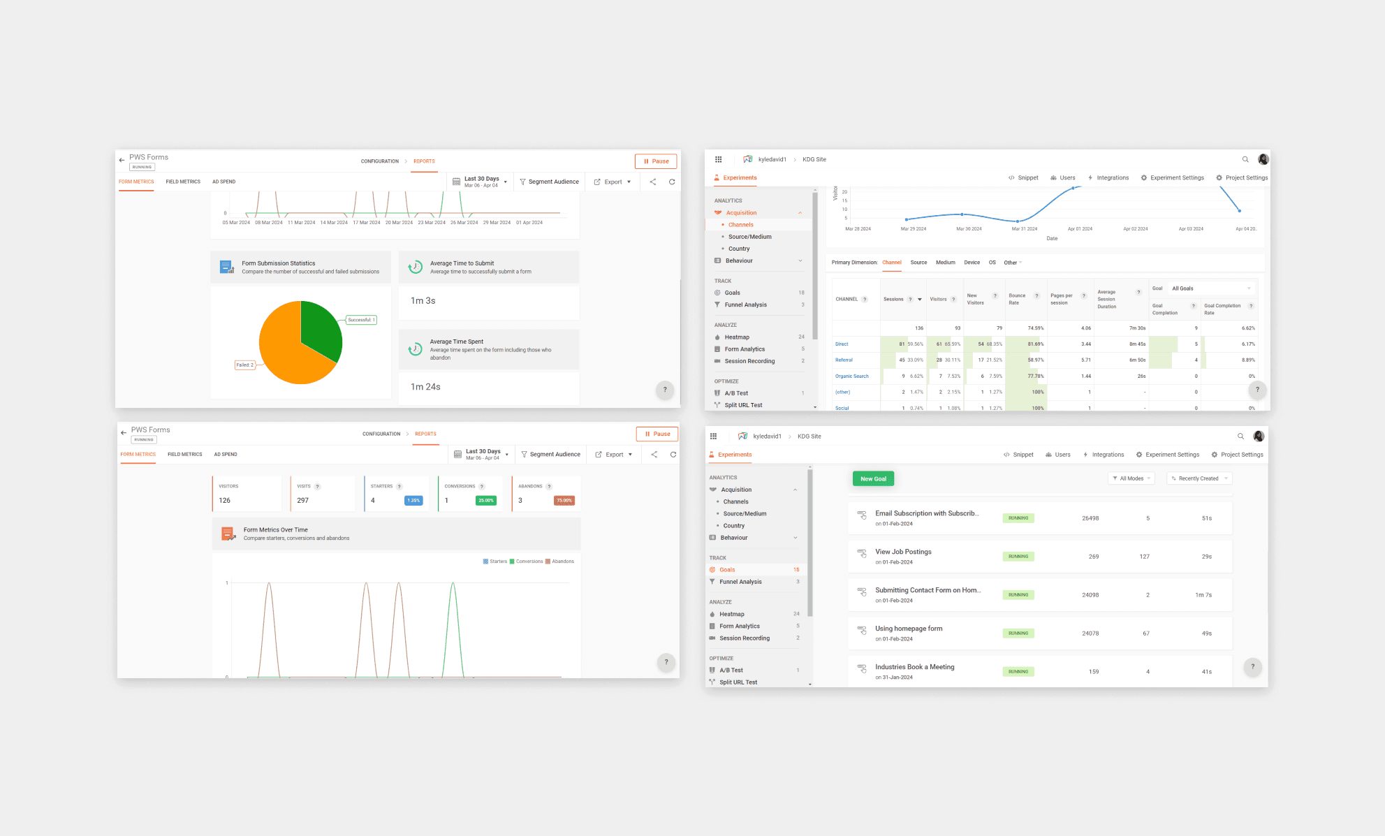
After launch, I set up ongoing monitoring with Zoho PageSense and Google Analytics to track how the new site was performing. I created heatmaps, goals, and funnels, and reviewed session recordings regularly to spot opportunities for improvement.
I also ran regular SEO audits and fixed issues like missing meta descriptions and slow-loading pages to keep things optimized.
Marketing Materials

Outside of the website itself, I took the lead on designing supporting marketing materials to keep everything visually consistent. This included whitepapers, email graphics, social posts, slide decks, and maintaining the brand guide.
Results - Over One Year Later
More than a year since launch, the website continues to show positive impact. Compared to the same period the previous year, we’ve seen meaningful improvements in key engagement metrics:
✅ 16% drop in bounce rate
✅ 41% increase in views per user
✅ 87% average engagement time per active user
✅ More qualified leads coming in through the website as reported by the sales team
These results reflect a successful foundation—and we're continuing to monitor performance and optimize where needed.

